Case Study: Crows Nest Mainstreet
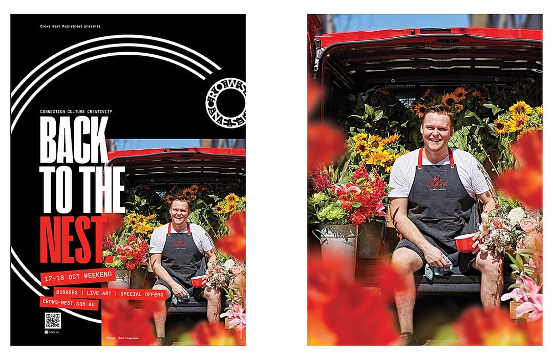
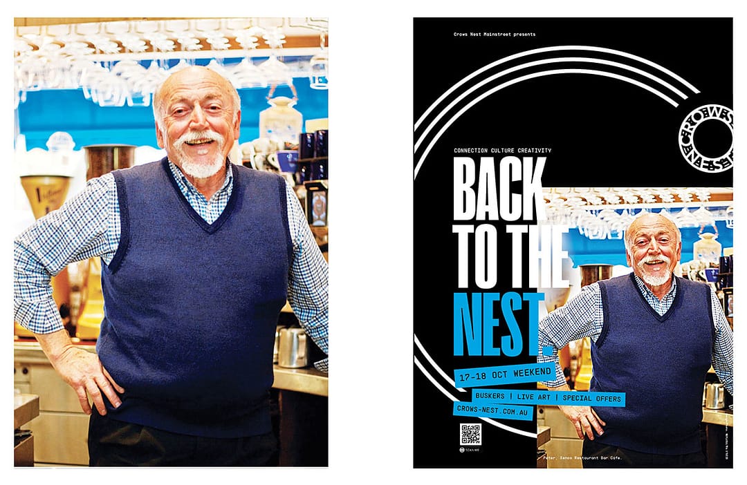
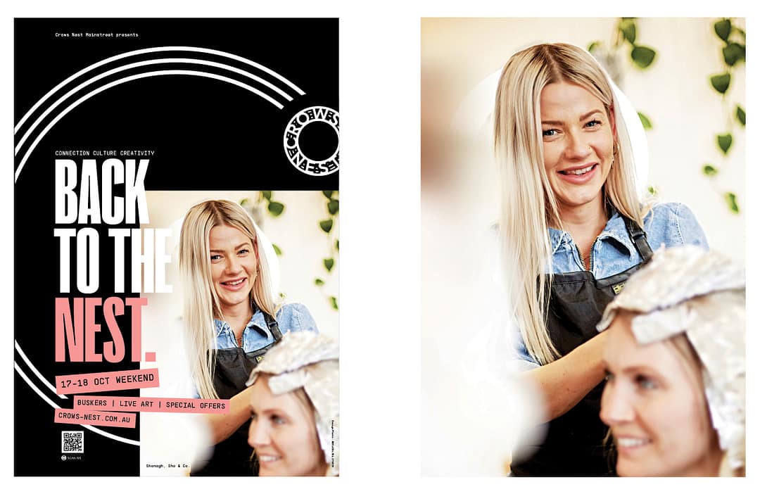
BACK TO THE NEST
We’re more used to seeing brands created for a product or service. But brand building a place can have social, economic and cultural benefits. Especially for a place like Sydney’s Crows Nest, with unlocked potential and positioning power.
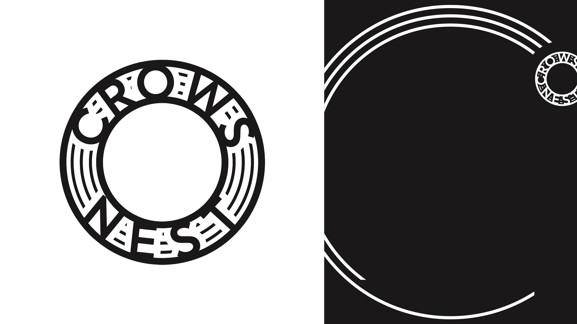
Crows Nest Mainstreet logo and ‘C swoop’ device.
MISSION
As the Mainstreet team were looking to rebuild their website, it was clear the area had more to offer than its current brand—with a haphazard comms strategy and an obvious cartoon crow motif, there was an opportunity to rethink the brand as a whole. A more strategic look at the suburb was warranted to signal it’s value to locals and visitors — to foster community and local pride, inspire experiences and new initiatives for growth.

From the Brand Book: ‘C’ you at the Nest—bringing locals home, and visitors to return, to experience the Best of the Nest.
Just 5 km from Sydney’s CBD, Crows Nest was named due to its elevated position—(helpful to know if only to get an image of a crow out of our heads!). It sits in the middle of five major traffic arteries that connect the neighbourhood to major hubs.
The village offers some of the city’s most exciting dining experiences, cafes, and wine bars, along with parks, creative spaces, and shopping. The next few years will see a significant shift as a new metro station is being built that will create more traffic, visitors and residents.
Demographically the area is culturally diverse, and surprisingly, 39% of people are in the 25-39 year age group, compared to 21% nationally.
The suburb with all its benefits and experiences was ripe to be positioned in people’s minds as an exciting destination that would translate back into its economy and social fabric.
Strategy / The first objective, was to rethink the literal approach with a name like Crows Nest. We explored the history of the area, what it currently offered, and where it was headed for the future. With so much to offer, the brand had to mean and signal something beyond the name.
The key themes that came through were (neatly) three ‘C’s for Crows Nest: Connection, Culture and Creativity.
Connection as a place to meet over dinner, wine or coffee, as well as its proximity to the city and transport; Culture with its mix of nationalities and expression; and Creativity with its creative agencies and artistic energy.
But listing those ideas it’s not enough. It’s what that means to the local or the visitor. In a place like Sydney, there’s a handful of places that come to mind as iconic and well travelled that are easily accessible. What we wanted to say to locals is, look what you’ve got right here, it’s your home, your community, your place to relax and be with friends—there’s nothing like coming back to the Nest. As visitors come to try new restaurants or experiences, there’s plenty here to come back for again and again to explore. Crows Nest is always worth coming home for and coming back to.
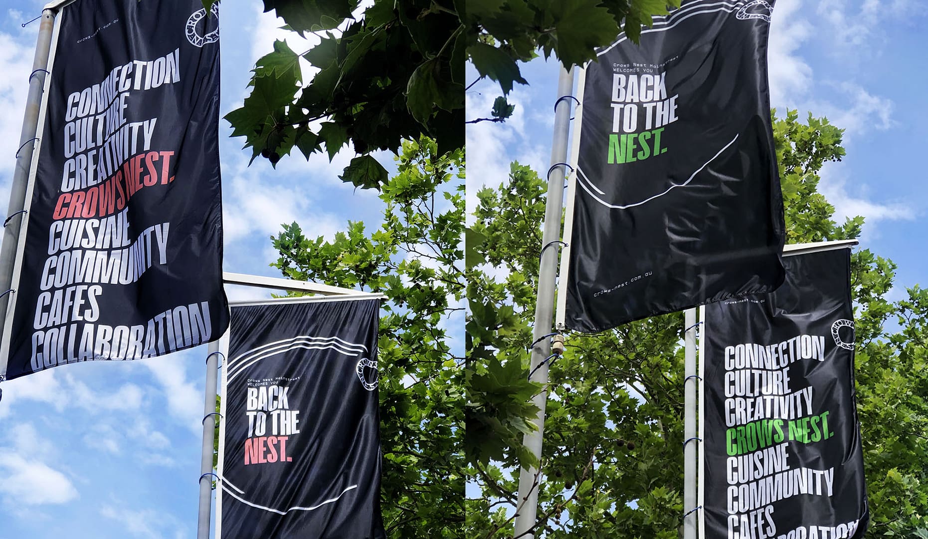
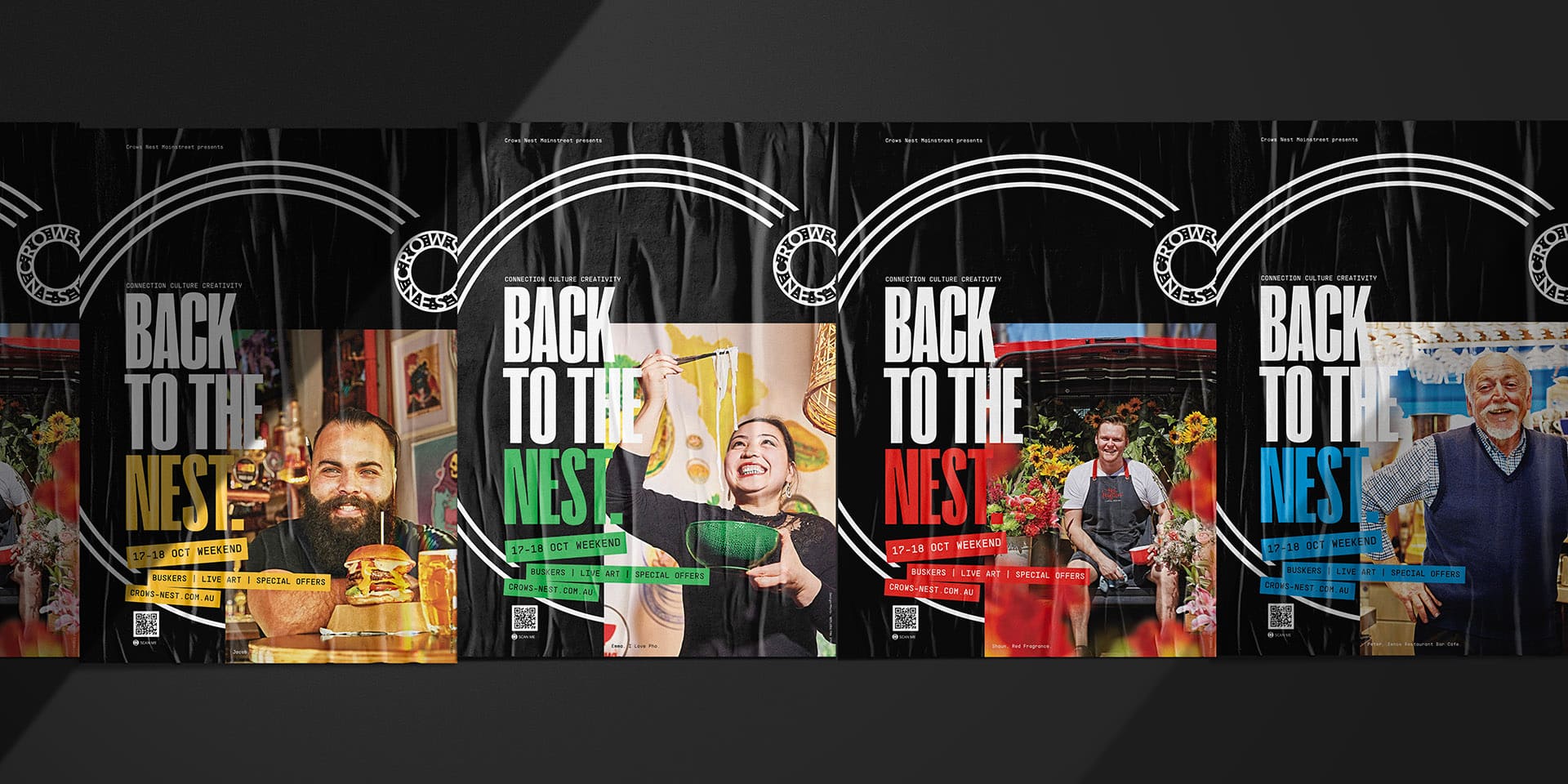
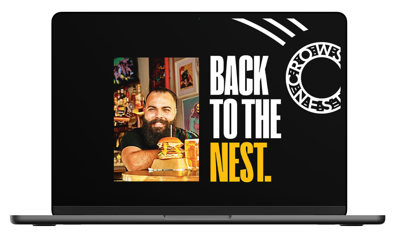
Once that was positioned, and a nod to a crow coming home, “Back to the Nest” seemed fitting. The ‘C swoop’ device shows the flight path of a bird coming to rest in the shape of a C, culminating in the Crows Nest logo, a hub of nested community.
Black was the appropriate hero colour for a place for creativity, and yes, its namesake bird. The initial brand shoot became the theme for the colourful sub-palette.
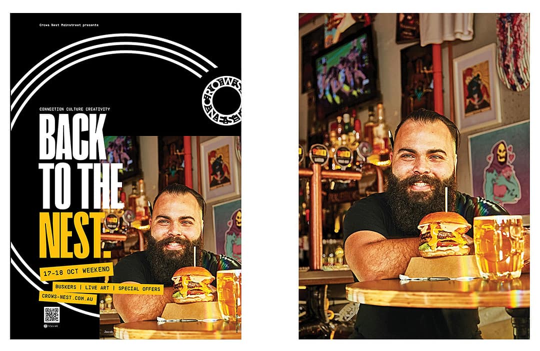
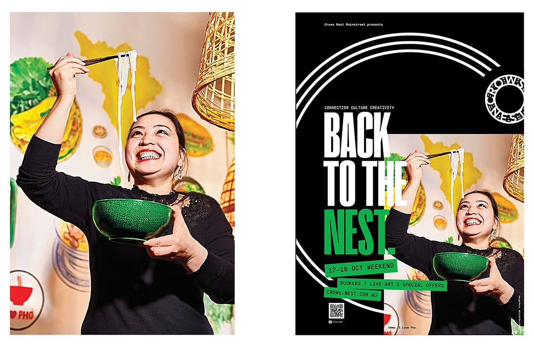
During COVID, we created a campaign to brand the annual festival and highlight the value of the suburb. Sub messages like Sydney’s Top Spot and Daily High, for social, highlights the foodie culture—it was fun to play with words and images.
As more events continue to unfold, like the annual Nest Fest, or Burger Fest at the Nest, the brand and message system is a bold and effective way to play with the voice and visuals that help define a literal place for a position in people’s mind.
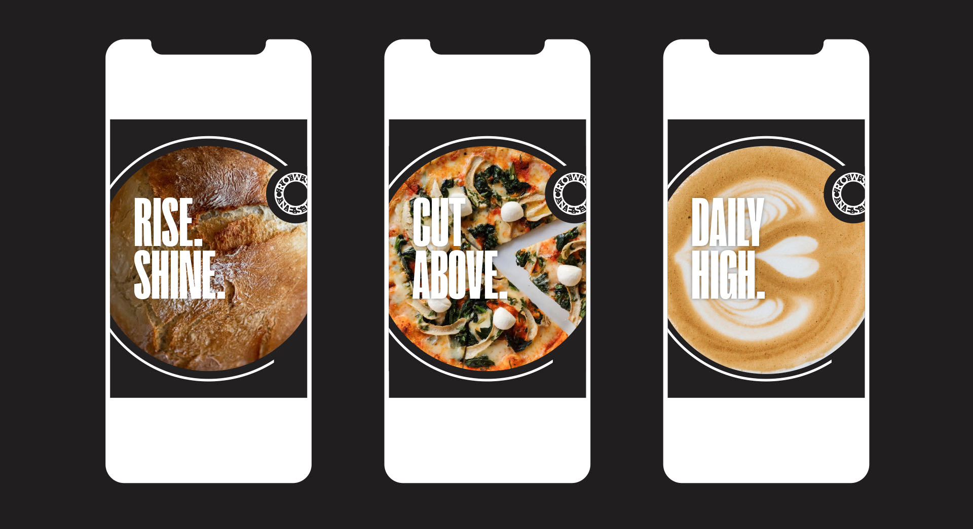
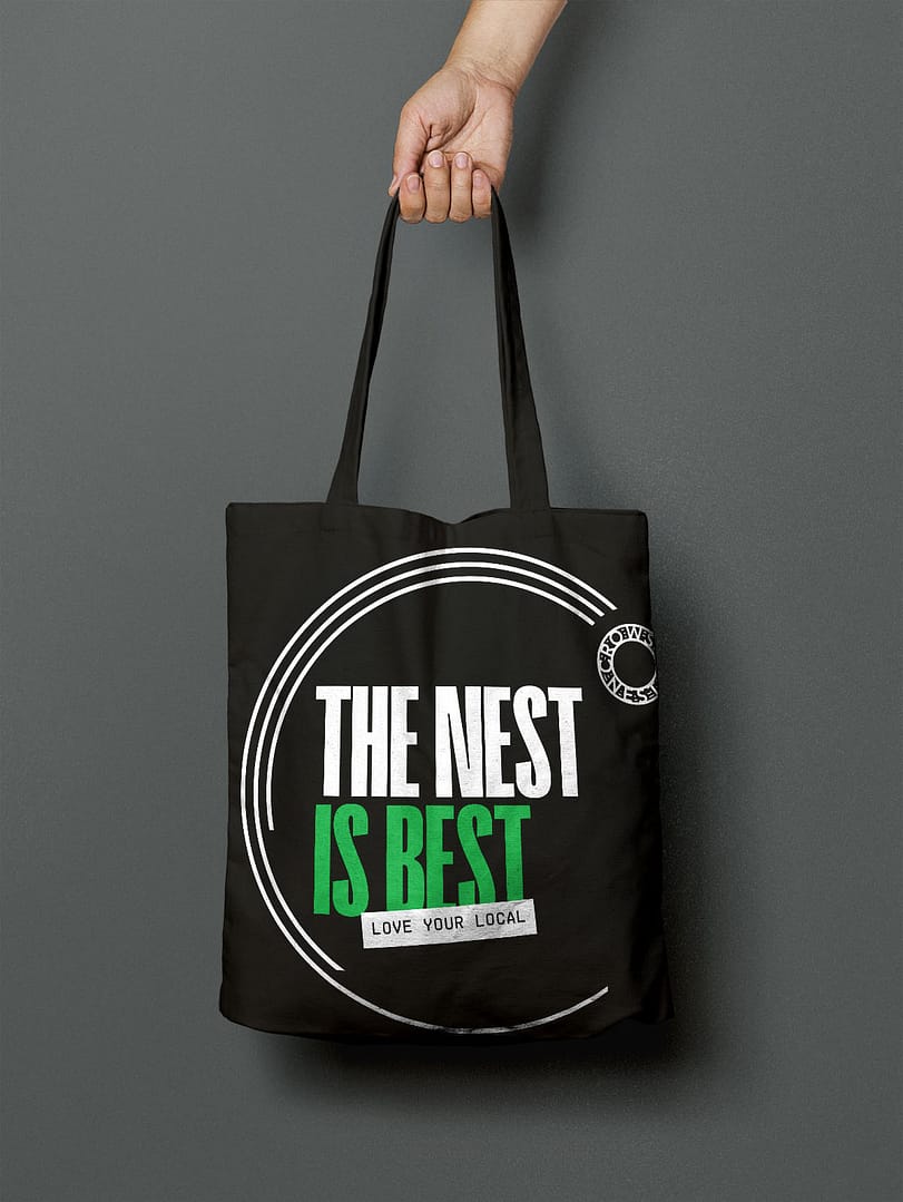
Play on messaging.
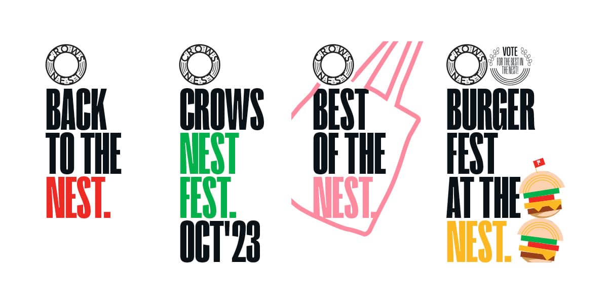
Typography system for ongoing events.
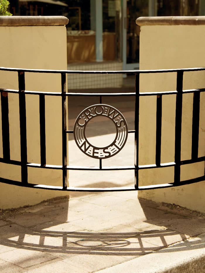
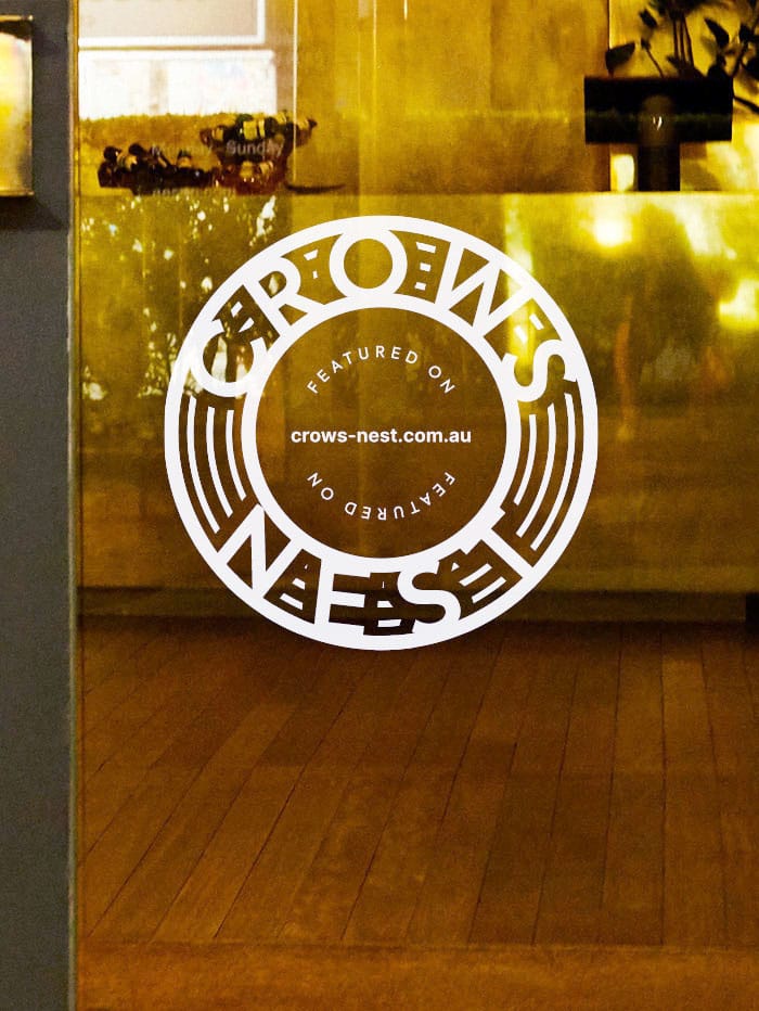
Fencing rebadge and store window decal to drive web traffic with web deals (concepts)
