Case Study: Bedford
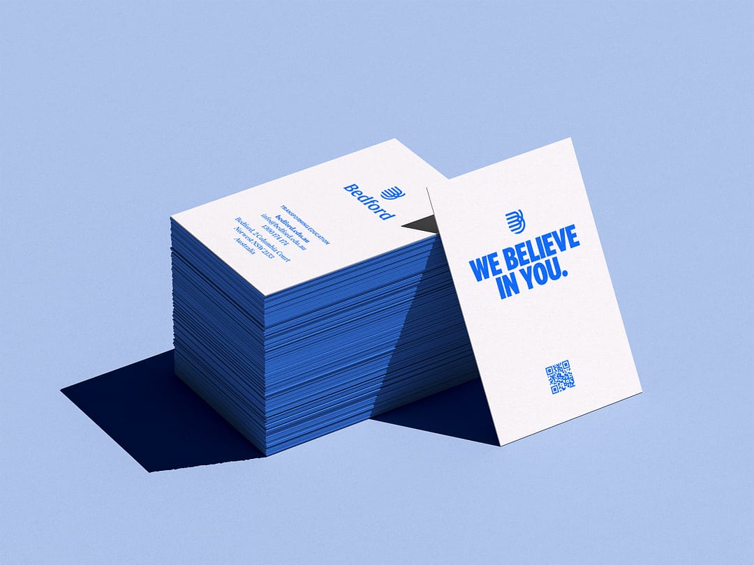
WE BELIEVE
IN YOU
Bedford has 80 years of history in vocational education. Although recognised by its alumni over the years, it needed to shift its operations and its brand to the needs of the next generation. While education has changed through the decades, Bedford’s foundational values are more important than ever.
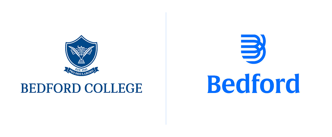
Then and now.
BEDFORD
Bedford was established in 1943 to meet Australia’s emerging social needs due to the devastation of families during World War II. Launched by the Baptist Churches in NSW movement, Bedford was formed to provide essential job skills required for a rapidly changing workforce.
80 years later, Bedford maintains a strong desire to make a positive difference in the world by giving everyday people equitable access to quality education leading to employment opportunities.
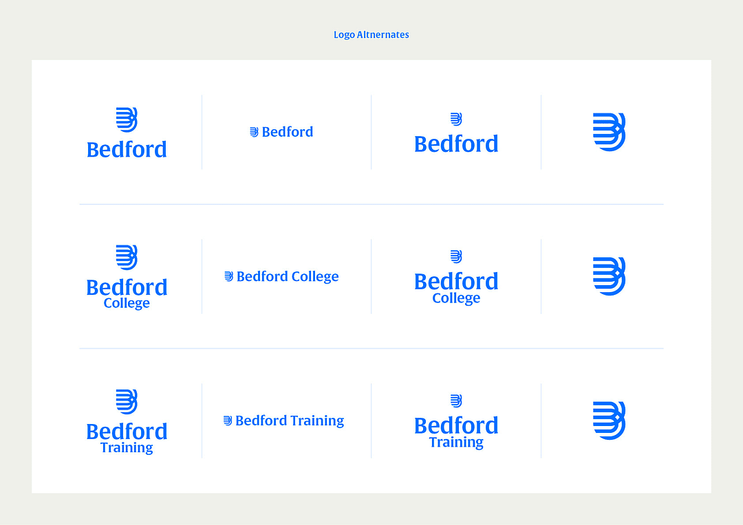
Logo.
Horizontal logo.
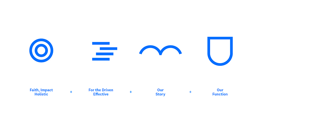
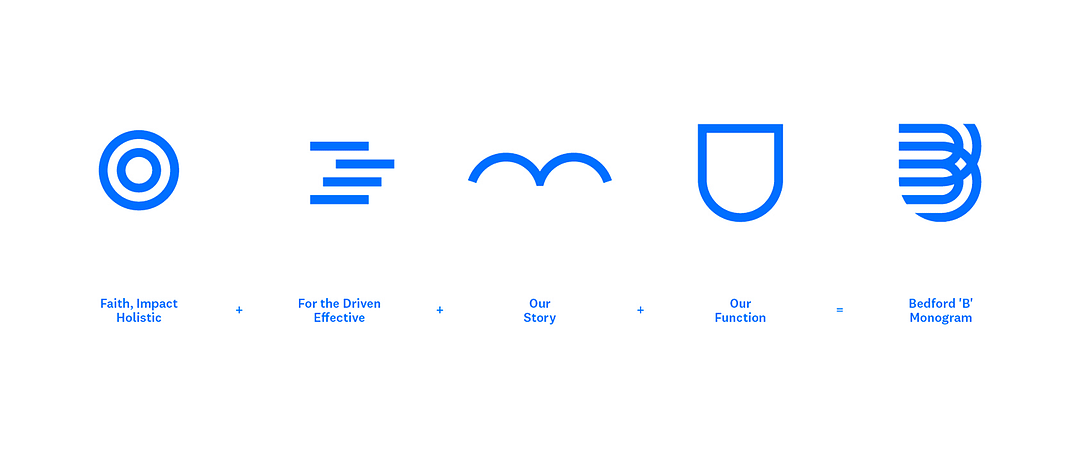
Icon construction.
Icon symbolism.
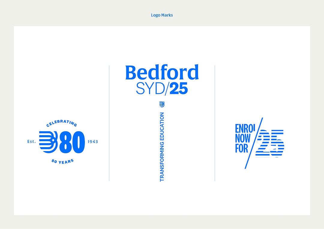
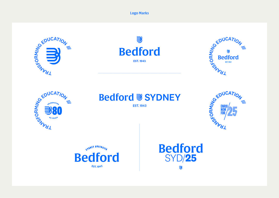
Logo suite.
Launch video.
CONTEXT
With the appointment of a new CEO, and a drive to see the brand move forward, it was an opportunity to rediscover who Bedford is, and what it means in today’s context.
The adult education space has two primary players, universities and vocational institutions. University, although the default for many, is expensive, in both time and money, with no real guarantee of a job afterwards. In the vocational space, the primary player is TAFE. But bureaucratic issues and the lack of depth that university supplies means that it’s not as effective as it could be.
Employers were also looking deeper at their candidates, looking for employees of culture fit and experience, as worthy of building an aligned team, not just individual academic success.
The contemporary social context also meant education is becoming increasingly controversially politicised, causing some to look for more values based options.

Brand Book.

Palette and layout suite from Brand Book.
Palette and layout suite from Brand Book.
STRATEGY
We defined the three key pillars of Bedford: Effective, Encompassing and Empowering.
Effective: students can graduate and be supported to find a job in less than a year and for much less money than university;
Encompassing: an holistic education experience, where students can achieve personal growth and build character in a supportive environment;
Empowering: truly supporting students to be who they want to be, not disqualify or leave them to struggle in the system.
Bedford had not only a lot of value to convey, an emotional benefit to connect with, but a compelling position to take at a time when people are asking more from their education institutions.
Transforming Education was the essence of a new purpose statement, about changing the experience in education that was for the student, not the system. It also tells a story about education that offers more than head knowledge or hand skills. But one that is deeper, encompassing the whole person, who they are, and the kind of person they want to become in life.
The brand needed to blow the dust off traditional sage-like bookish serif fonts and symbolic shields from an institutional heritage. Rather than complex, disqualifying and unsupportive, the experience should feel simple, welcoming, and empowering.
‘We Believe In You’, is Bedford’s message for those that wanted more than the current system was offering, and delivering it more effectively, with stronger student support. These benefits are built on a foundation of belief in what is not only seen and can be measured, but the also the deeper, hidden potential in every student.
Its position is tied to its DNA of faith and empowering hope, and reframed in for today where the experience of education is lacking for many.

Palette and layout suite.

Prospectus.
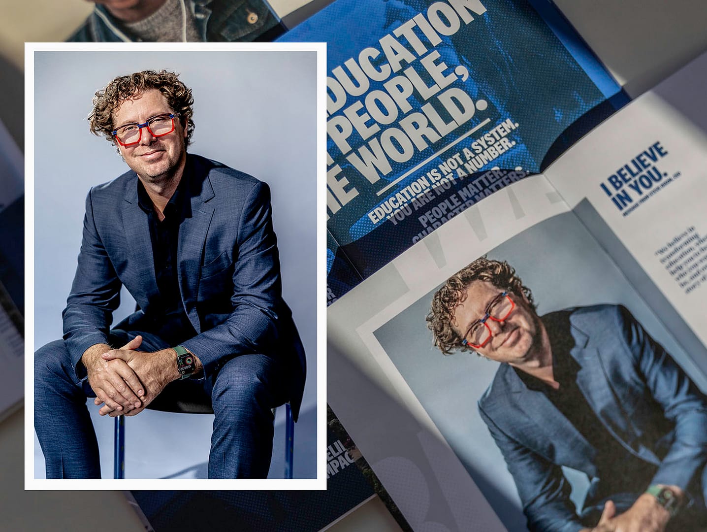
CEO Shoot and Prospectus.

Palette and layout suite.
Icon.

Palette and layout suite.

Palette and layout suite.
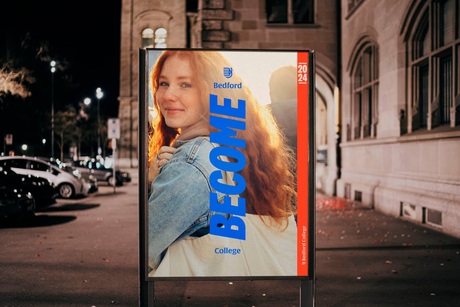
Palette and layout suite.
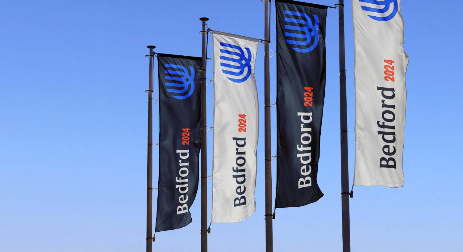
Palette and layout suite.
EXECUTION
The brand taps into our hero’s journey, and part explorer. For those who want to live bigger, and explore a new future, but still welcoming and not alienating. It’s less academic and conservative, more aspirational, empowering with an element of self-discovery.
The new logo is born out of the brand’s connection to baptism, the student’s personal impact and growth, the speed of effectiveness compared to the competition, and the identifiable monogram ‘B’. Something our avatar would be proud to wear outside the college.
The colour palette links to baptismal water but adding an empowering red and explorer green.
The typography and tone of voice are bold and empowering using Klim Foundry’s National and Family.
The imagery gives a sense of discovery and beginnings with optimistic hope.
Overall there’s plenty to play with in creative expression to build the new brand experience, with boldness, colour and energy.

Site signage.

Wayfinding

Entrance lighting, 3D signage, decals

Entrance lighting, 3D signage, decals
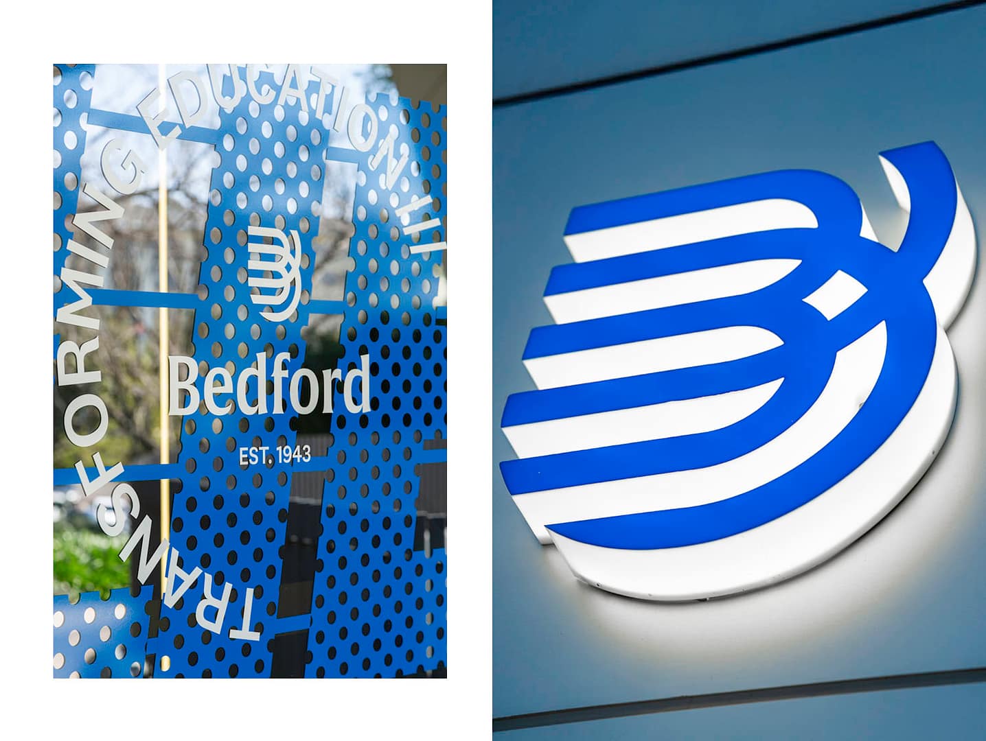
Decals. 3D signage

Interior lighting and design.
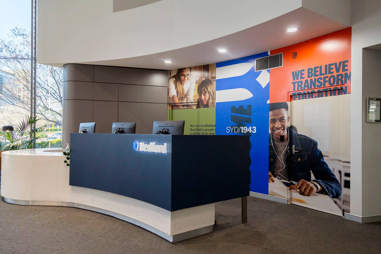
Interior lighting and design.
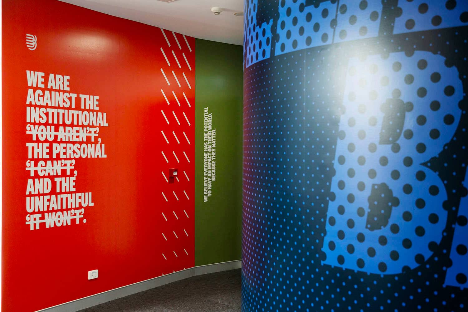
Interior lighting and design.

Interior design.

Interior design.
