Case Study: Baptist World Aid
BETTER WORLD
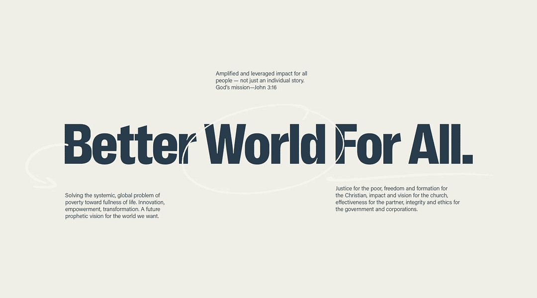
FOR ALL
At a glance, there was nothing ‘wrong’ with the Baptist World Aid brand. It had a focused mission to end poverty, it was a significant force in the non-profit space, and recognition particularly among its Baptist community was high. But when COVID hit, half a billion people were at risk of falling into poverty by 2030, and it was time to pivot and reassess.
BAPTIST WORLD AID
Since 1959, Baptist World Aid Australia is a Christian aid and development organisation working with 38 local Christian partner organisations implementing 73 projects in 18 countries.
From the Brand Book
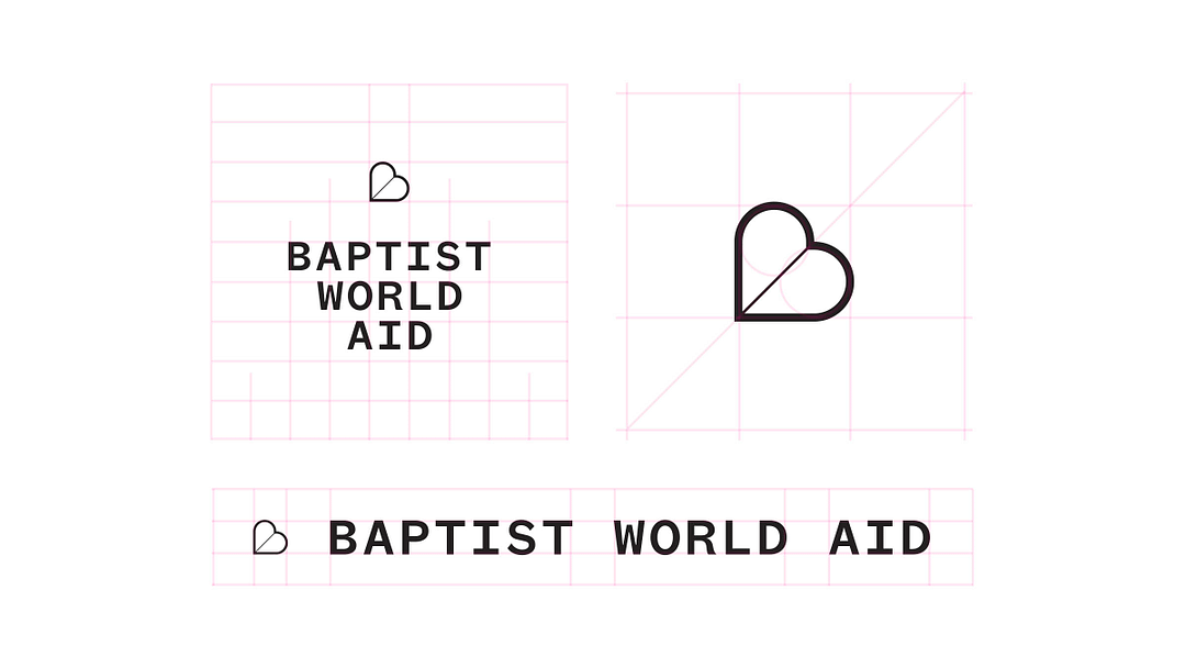
Lock-up construction.
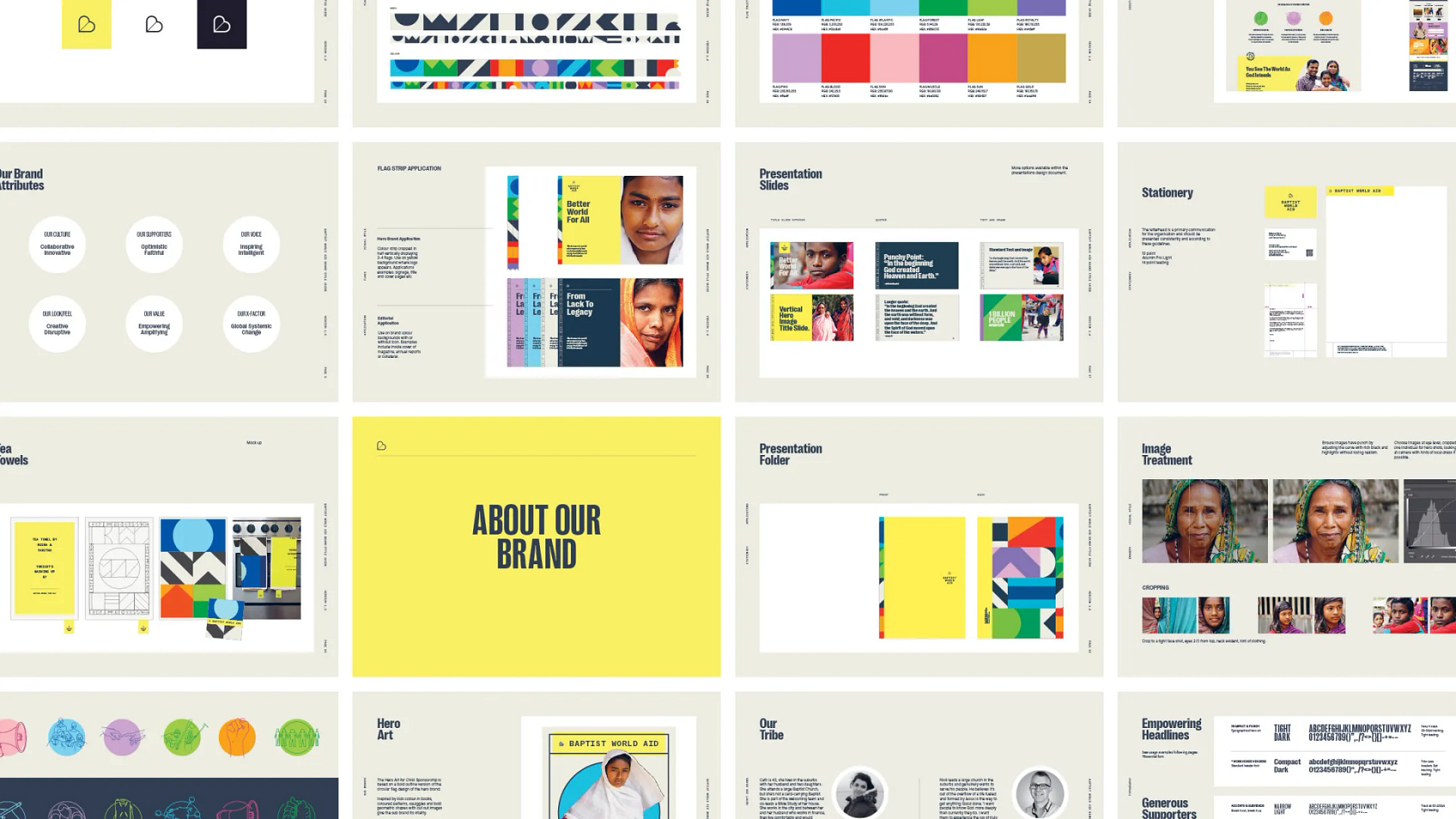
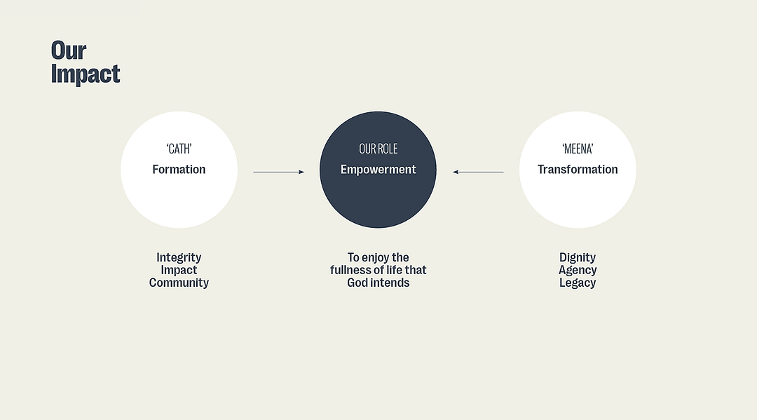
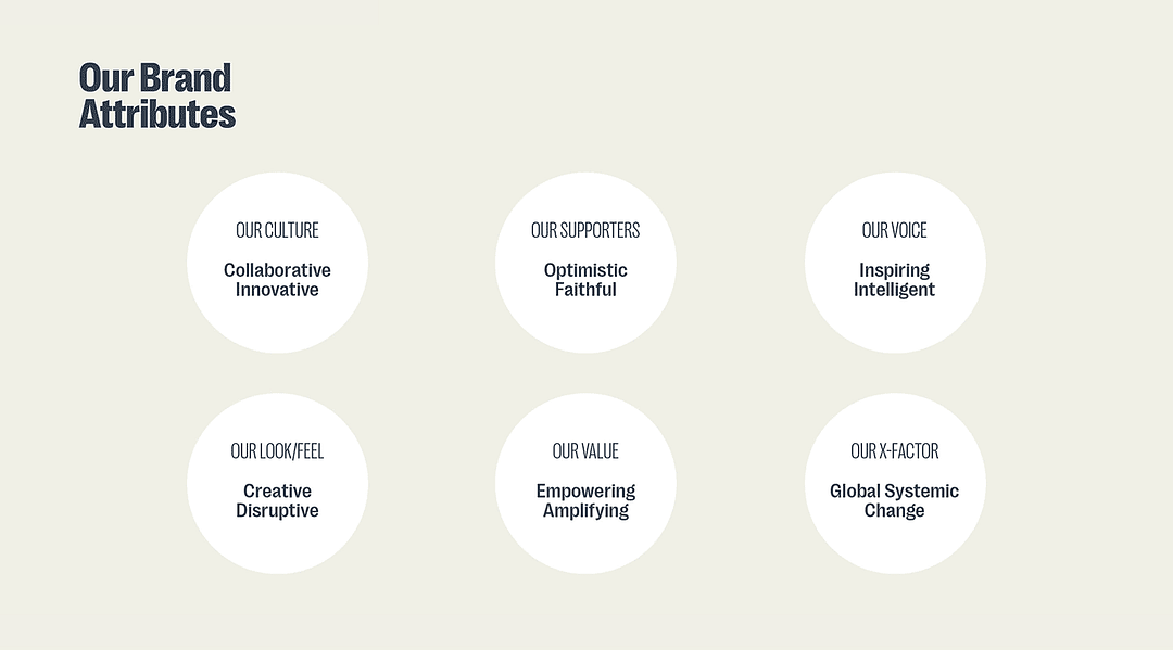
Brand Book excerpts
CONTEXT
During the pandemic on the ground contact became impossible. Baptist World Aid needed to change the way they served people trapped in poverty, particularly its development programs. It was a matter of survival for millions that needed their support—and to some extent the brand itself.
Early in the first phase of lockdown, they began asking, how can we be effective in this new unknown with no roadmap for operations. This opened up even more questions about the brand: How are we still relevant and what is unique about us? Is the tone of the brand aligned with our values? Who will we be serving in the near future as the supporter base begins to shift?
On examination, the first thing that stood out was the tone of voice in critical comms. The copy was not reflecting the core organisational values. Part of their identity was becoming lost and that meant losing connection with their audience.
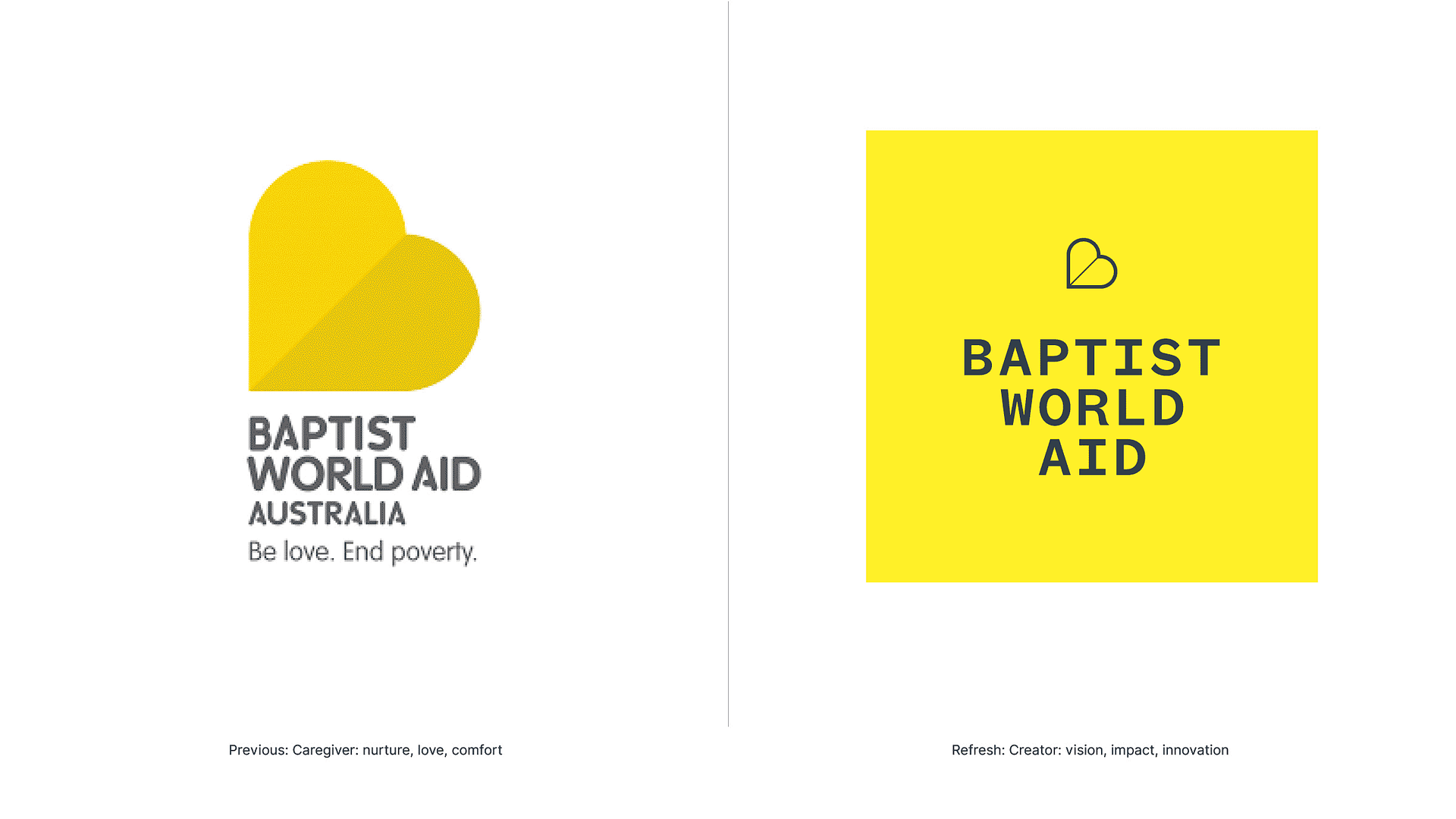
The second was the brand archetype. The Caregiver, although common in the space, didn’t reflect the heart of the brand—one that was visionary, innovative and impactful.
Thirdly, there was a concern that with an ageing supporter base, the next generation had more options to invest their giving beyond traditional non-profits. New and innovative approaches were helping people express their values to help those in need in ways beyond loyal giving.
The brand needed to rediscover who they were, what meaning they gave to its supporters, and who was most effective to target. At the same time, the world was changing rapidly. People wanted to be a part of shaping they world they lived in, and not just depend on others to shape it for them—this was a great opportunity to change things up.
STRATEGY
We began an organisation-wide strategy process by examining brand purpose which gave some insights into the heart of the brand. The previous brand captured it’s focus, but there was a lot more going on.
Their work showed a maverick character—they were agile, and innovative. They lead the charge for systemic global impact in their denomination. They partnered with corporates, governments and communities to make change for and with those in poverty. They mobilised the Church and PR to use their voices to spread the word to transform retail. They had a vision that the world needed to change, and we were all part of the problem—and solution. The reason, to share the fullness of life that God intends.
In essence, they weren’t trying to care for people in poverty, they were about getting them out of it by whatever means, and did so by thinking outside the box. It wasn’t just about serving those in need, but fixing the system that created the issue. It was a complete solution to the problem they were chasing, not just a band-aid. It was about creating a new world, where all things were set right. Where everyone in the chain of global poverty could have a better way of life—and that included their supporters who wanted to have an impact in the world as well.
Knowing this, the Creator archetype seemed like a better fit to express the heart of the brand, enhance meaning and establish uniqueness. This archetype resonated strongly internally as well.
This meant the way they showed up could be different. They could tell a story not just about the need to be caring for the poor, but inviting others into the story of transformation and empowerment. Where we could all have an impact and a voice for the world we want. The tone of voice could now soar with the rediscovered values. It was an opportunity to be optimistic, hopeful, yet challenging and empowering to achieve the vision.
The character of the brand could be more generous and value-driven. It became about the value or inputs the brand could impart to the supporters to help achieve the shared mission. This suited the next generation who were looking for ways to get involved, to model global citizenship to their families, and embrace their own discipleship walk.
The dynamic of the brand changed from an ask, to a give. This framed a new way of thinking, based on supporting their supporters in their journey to becoming the kind of people who do things like this—and, developing a real relationship of oneness and connectedness with those in poverty; a shared vision to achieve together.


OUTCOME
The brand had new ground to stand on. It embraced an optimistic, empowering and prophetic voice. Its new emotional charge had alignment with the core work it was doing—big, bold, with a bright hope.
It first need to replace the Caregiver language and soft curves, with bold, innovative and optimistic creative. Even though it is difficult work, there’s something to celebrate. The issue is not being swept under the carpet, ‘we’re doing what’s good and right in the world, and building the world we want, a new earth that we can play our part in’.
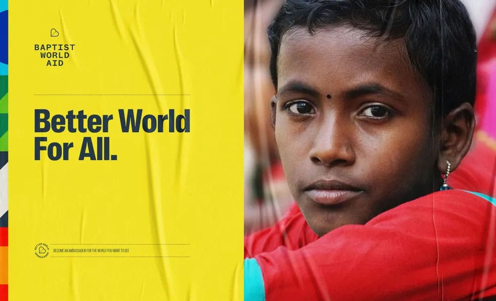
The tagline took the acronym for Baptist World Aid from “Be love. End poverty”, to the visionary and inclusive “Better World For All”. Throughout the chain, from individuals, to churches, governments, corporations, communities, we’re all beneficiaries of helping others, becoming better humans, making an impact at scale.
The BWA acronym formed a global flag system to symbolise that celebration and the new earth we’re working toward. It gives the brand the new creative legs it needed and a signature bright colour palette in the space.
Imagery is still centred around people trapped in poverty, but cropped close for intimacy and suggesting close relationship. They’re not “over there”, they’re people like us, part of our world, and our lives.
We were able to work with the brand with the end in mind. Previous brand touch point could be rethought and made fit for purpose, with small details like call to action areas on direct mail letters, seasonal email footers, and designated emergency appeal banners on the website.
A whole range of merchandise is being created to foster a culture around the mission, and become part of family life as talking points like dish towels and journals.
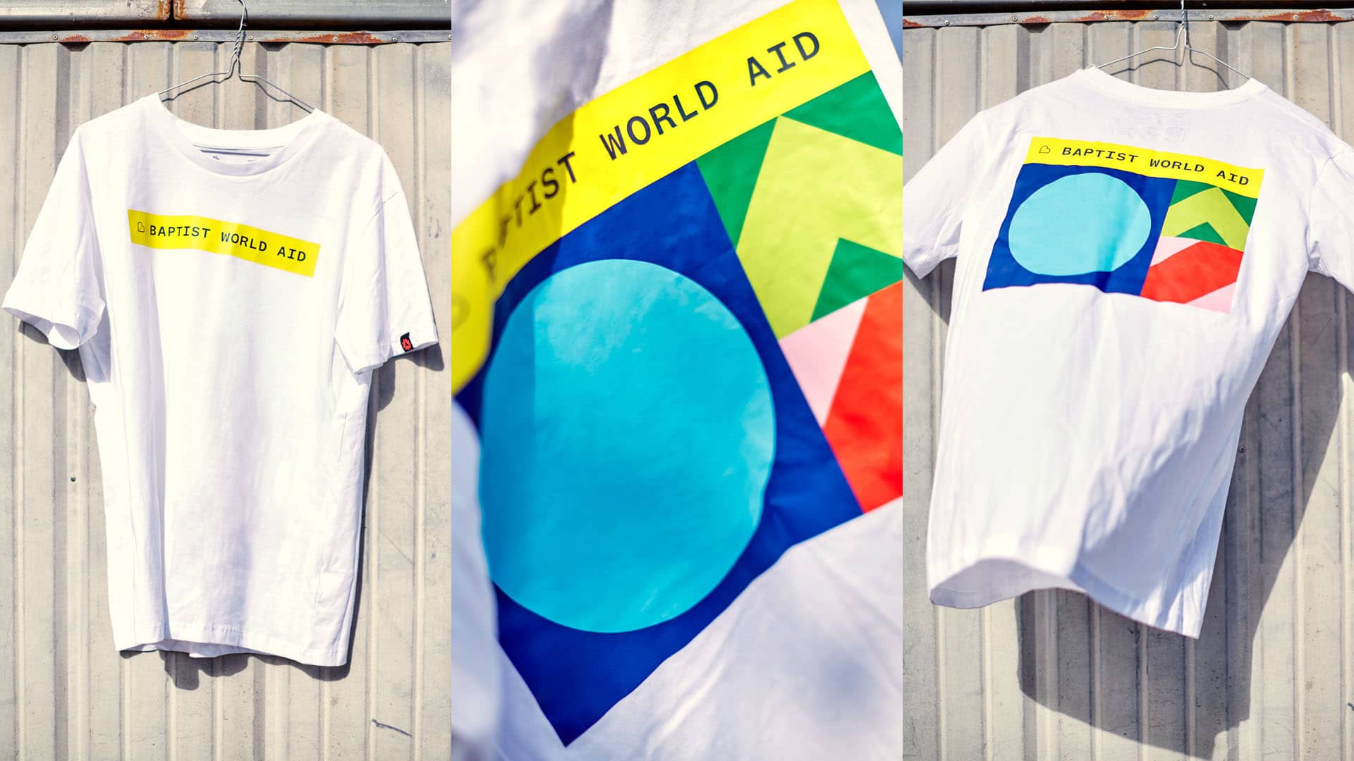
T-shirt (front and back)
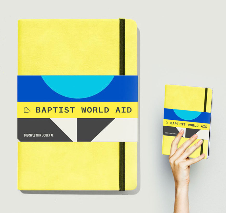
Journal and tote
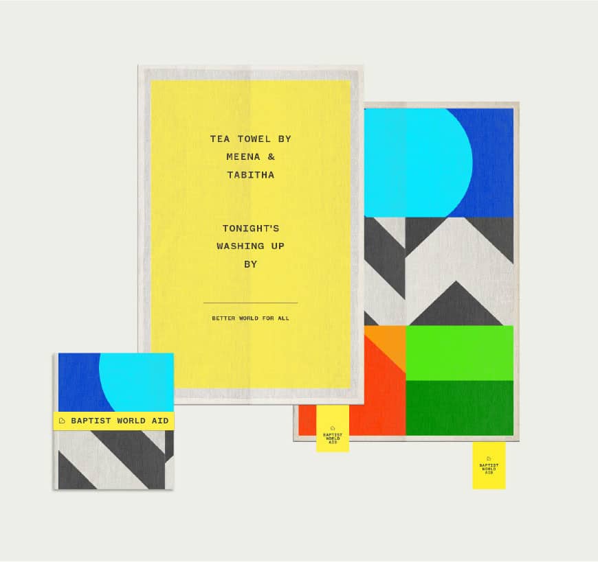
Dish towel
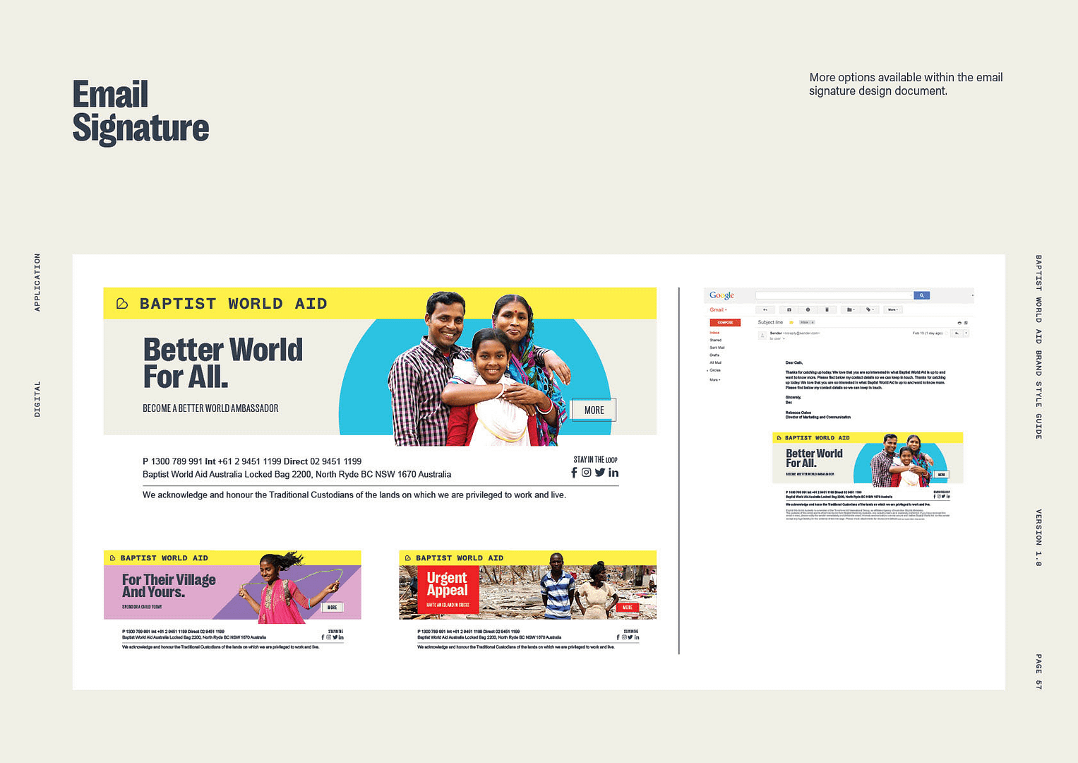
Email footer templates from the Brand Book
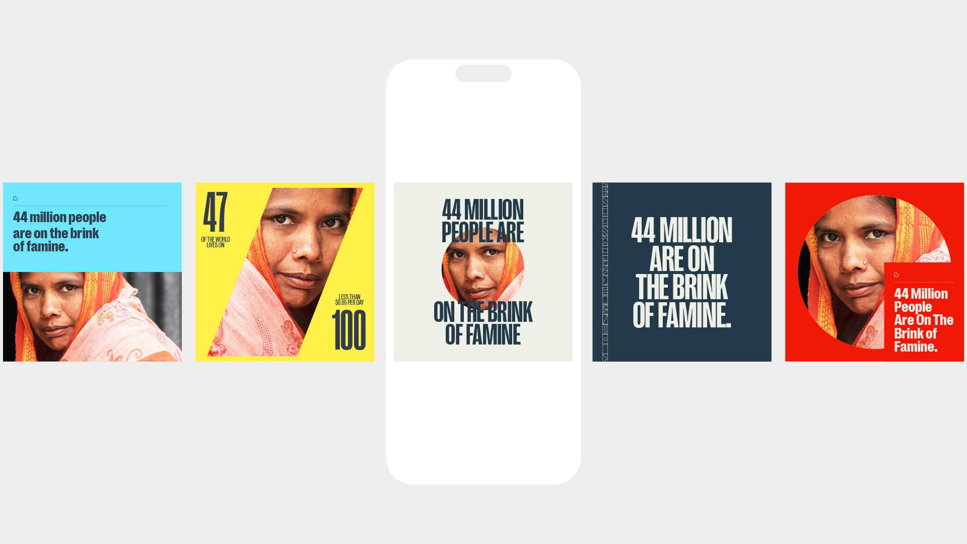
Social Templates
The website was given a total makeover to align with the new brand in messaging, visual style, inconography and photography
NEW PRODUCTS
With the new values, a new product offering was ripe to be introduced, and a rethink of the old.
Better World Ambassador is Baptist World Aid’s new regular giving offering was developed out of the strategy process. Its developing expression fits neatly with the aims of the brand to build disciples, not just givers, and is an effective way of supporting the mission. A new logo was developed and hero art to align itself with the core product of the organisation.
Child Sponsorship was given a positioning and aesthetic strategic rethink. A new brand look was developed with a suite of supporting messaging, imagery and collateral for the customer journey.
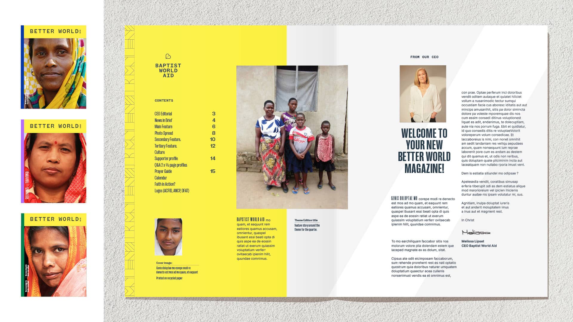
Lastly, the Better World magazine was created as a tangible regular news in brief to keep regular supporters engaged and informed about what they and Baptist World Aid are doing together across the globe.
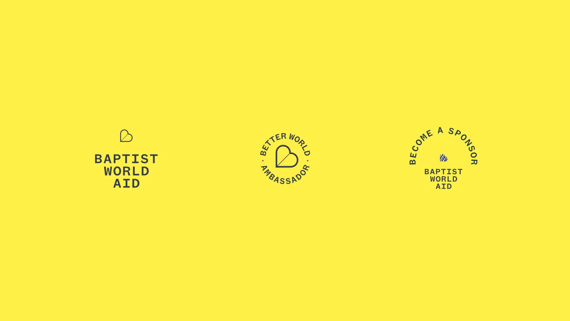
Primary and sub-brand logo suite
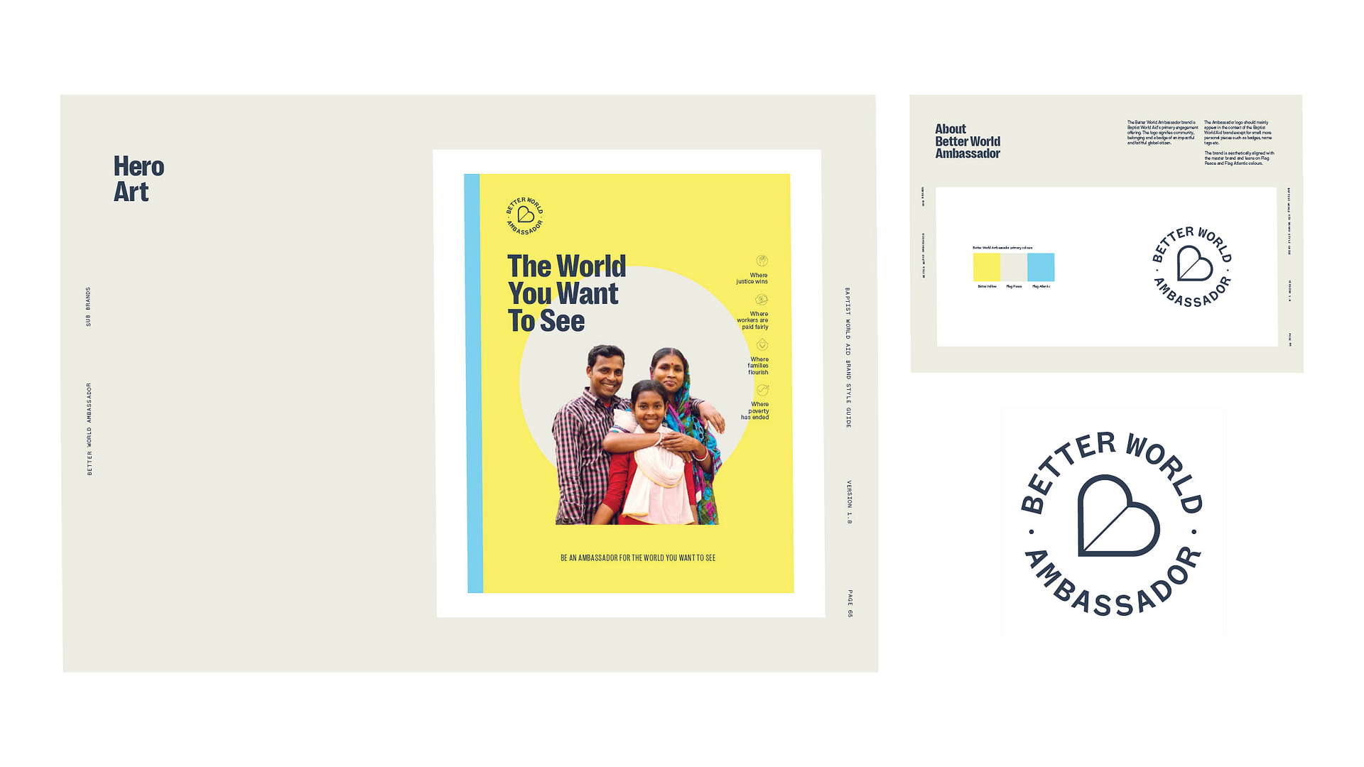
Better World Ambassador sub-brand
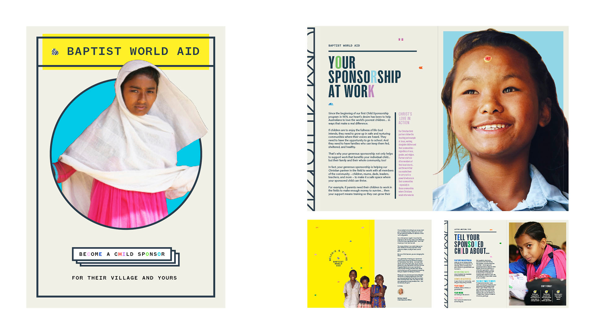
Child Sponsorship sub-brand
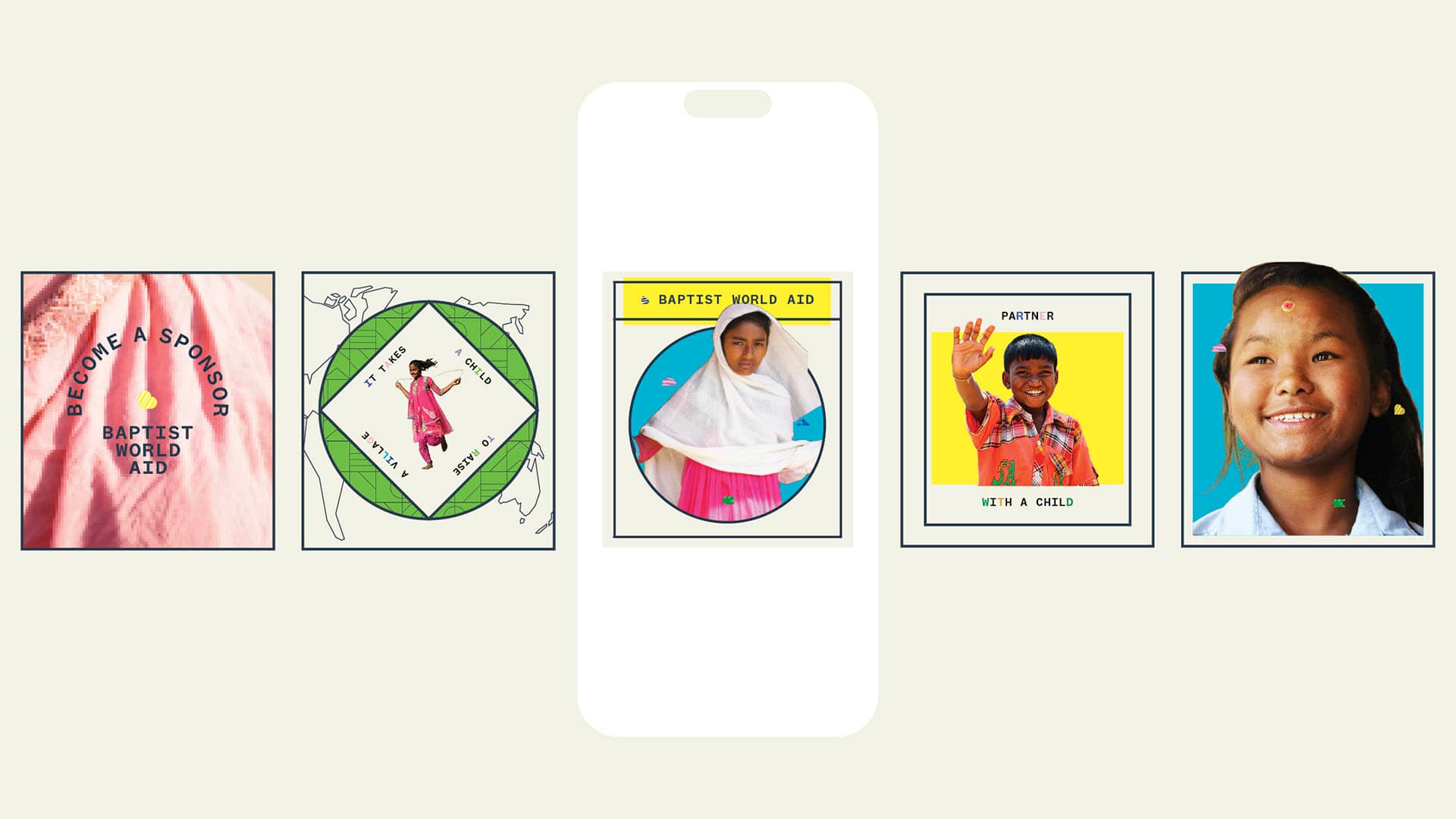
Child Sponsorship social template
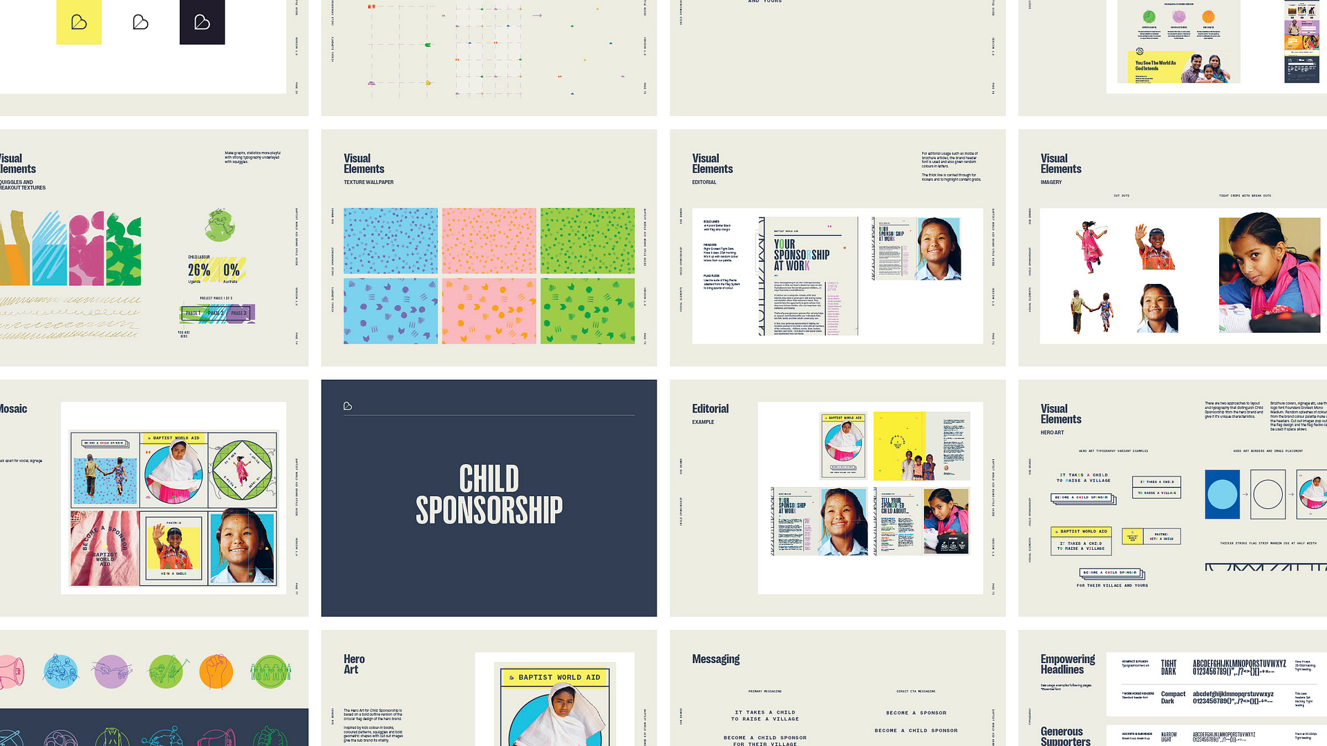
Child Sponsor Brand Book excerpt
