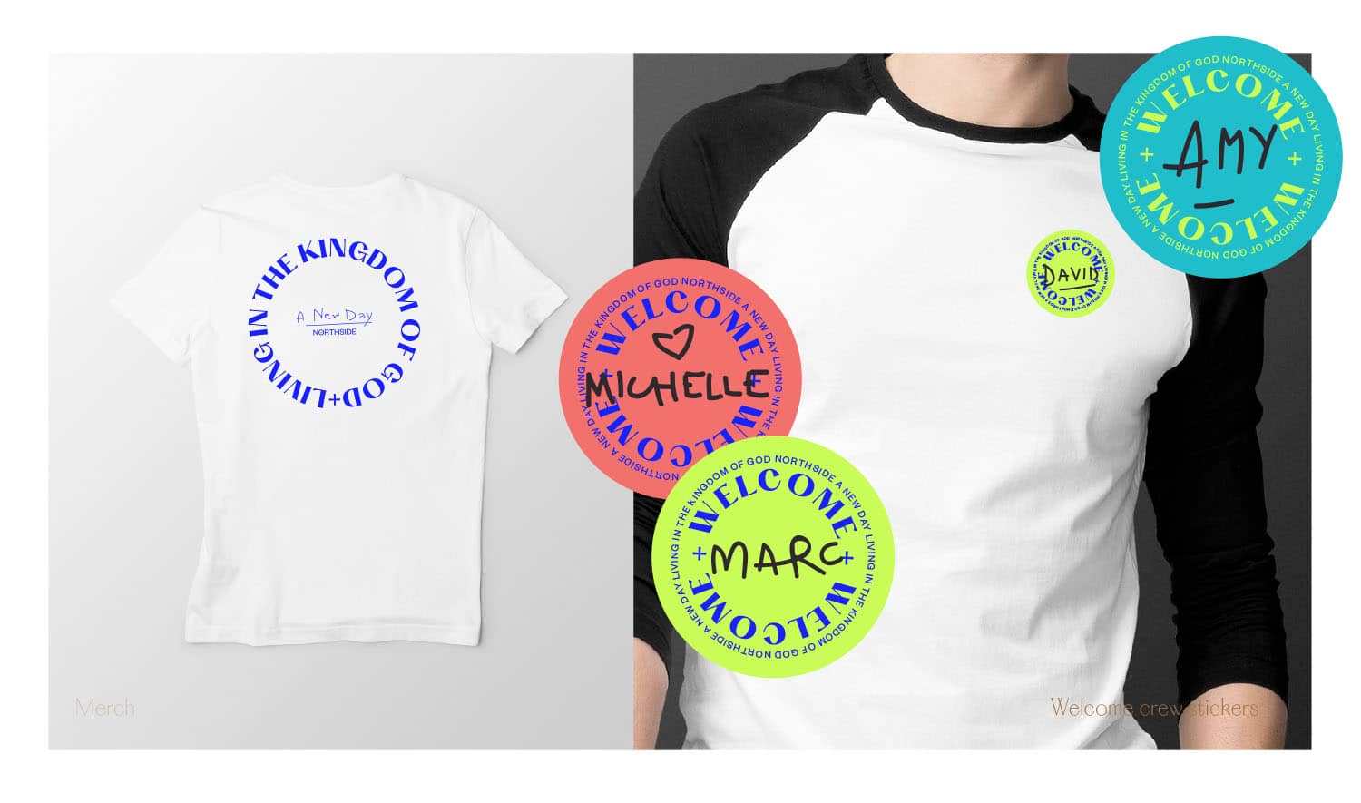
Outcome / The congregation has a high number of believers engaged in justice organisations and working creatives. Northside’s mission was a match with its desire to help believers express the formation of a relationship with Jesus into the world, through imagining a better way forward. There was also an emphasis on creative expression, worship and communications. The archetype they needed to activate was not the sage, but the creator: a need for innovation and expressing vision, with a dash of the explorer: a desire for freedom and finding who you are through exploring the world.
This became clear with an in-house survey, the transformations that had been made were in line with both these archetypes: expression and freedom. It was felt it but it wasn’t expressed in a strategic way for people to ‘get’ it. There was a misalignment in what we were doing, to what people were feeling and wanted.
As part of the brand roadmap we established goals, articulated the core of Northside, what it stood for, it’s difference in the church landscape and questions like “what business are we in?” that revealed deeper emotional thinking.
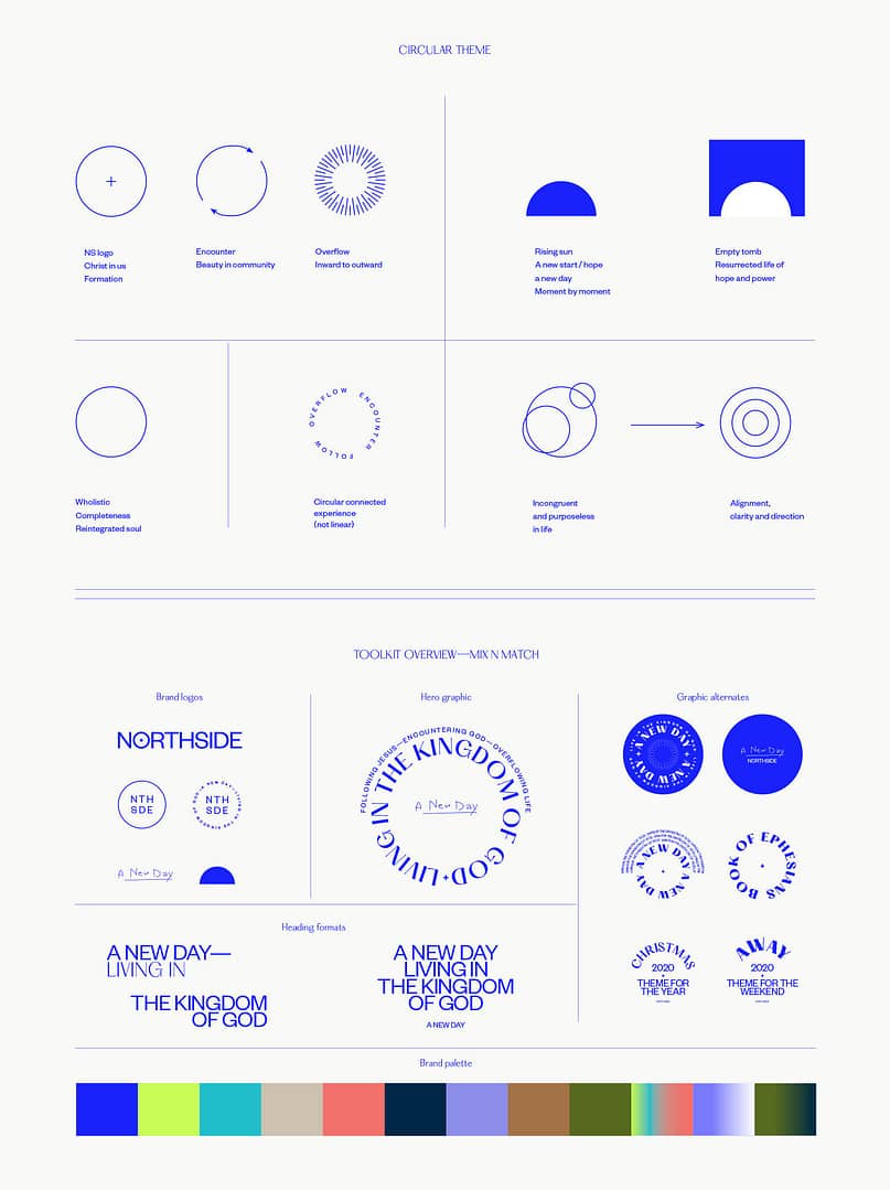
The messaging that surfaced gave form to the visual interpretation. Circles became a theme with framework of discipleship feeding into encountering God which feeds into overflow and around again. Alignment, wholeness, overflowing, rising suns of hopefulness and empty tombs for the resurrected life contributed to the seed of the idea.
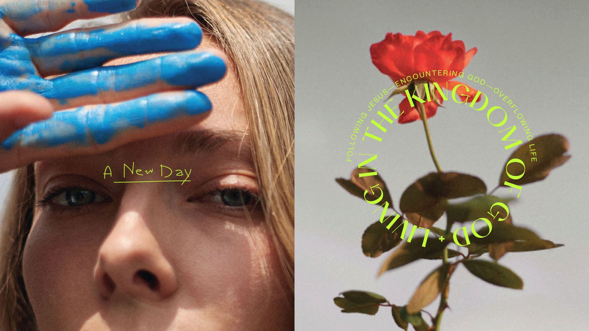
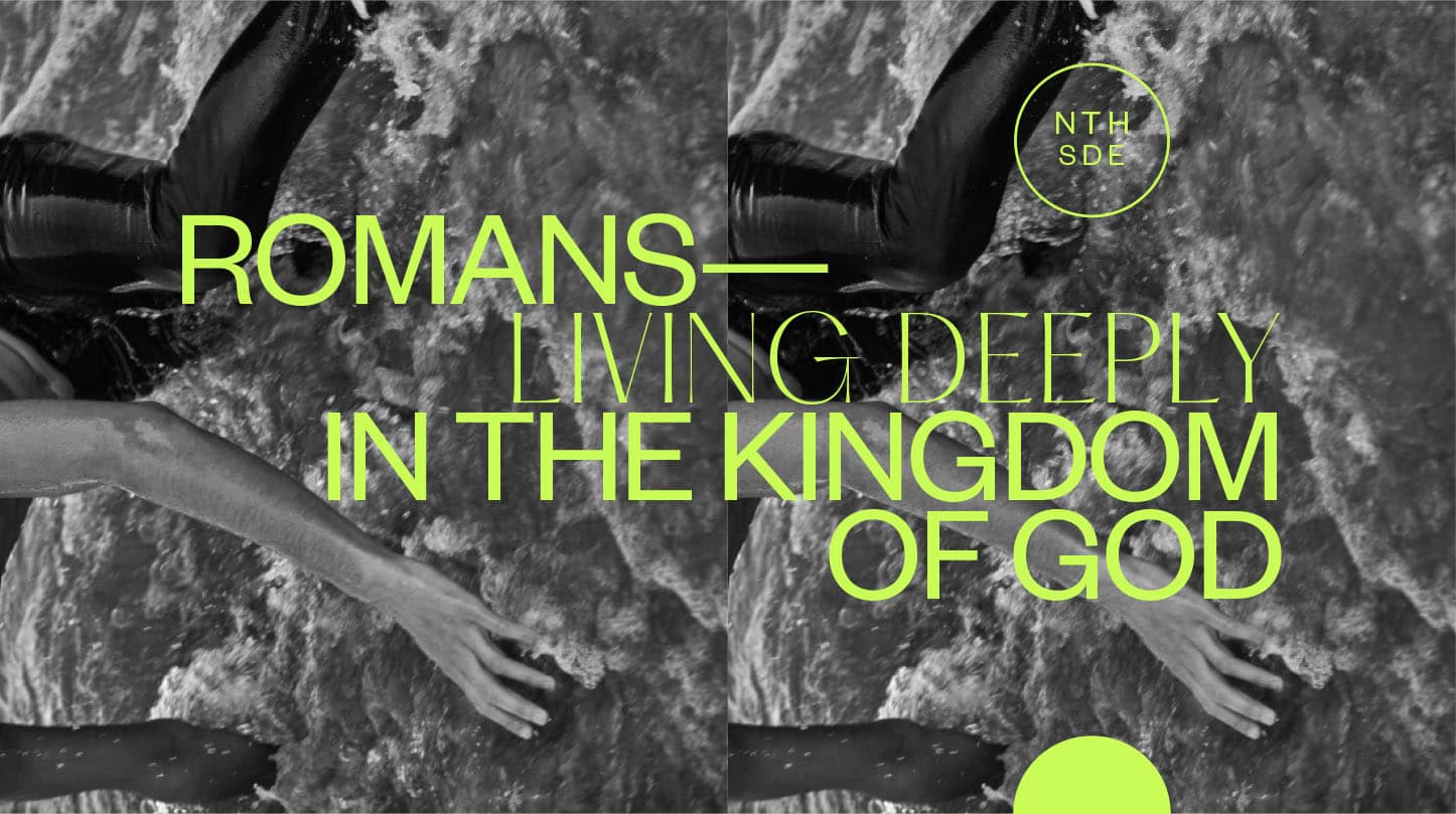
The design and imagery needed to evoke the creator explorer archetype with the brief for photography to illustrate the idea of co-creation—humans engaging with creation by creating something new, with a style that would fit in the pages of creative design and fashion magazines.
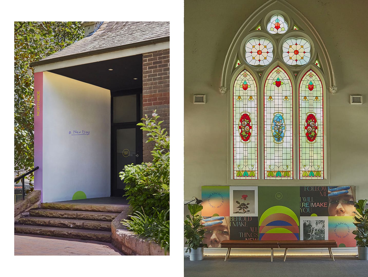
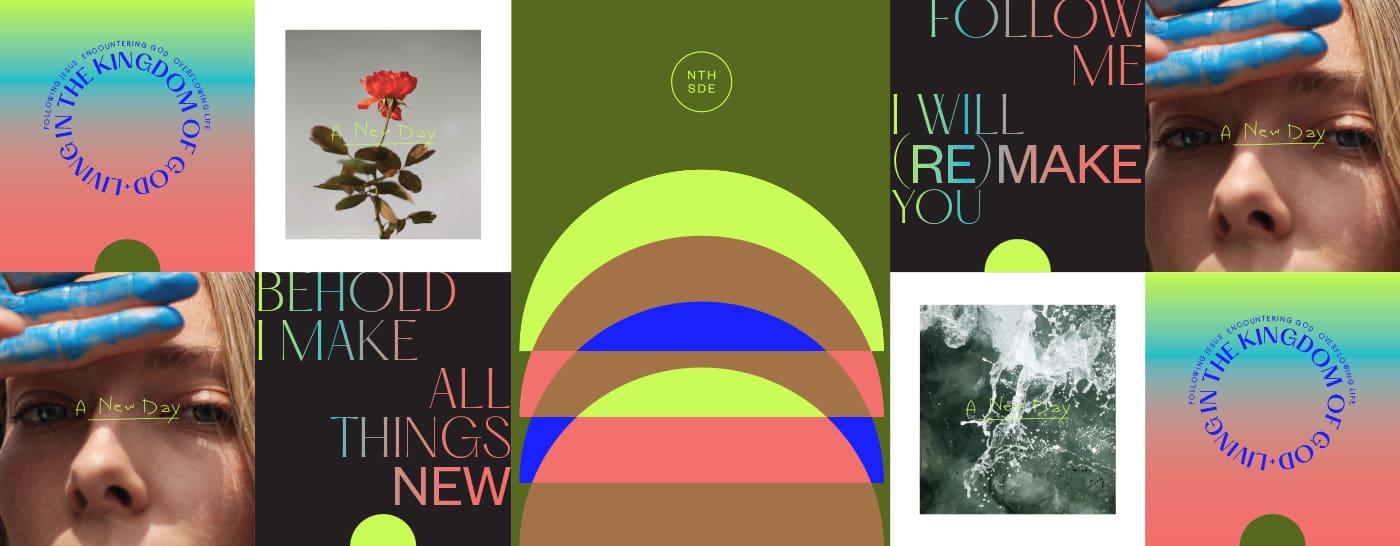
There needed to be enough creative legs in the design for it to be interpreted in different ways so as not to become stale too soon where resources for imagery we’re limited. It also had to have capacity to be used for different messaging that explored the gamut of life experience. A brand toolkit was developed that focused on 2 fonts, including the logotype to maintain brand recognition while allowing for great flexibility in a brand system under the hood to maintain consistency in the creative expression.
For the new year celebration a series of five mini-films were produced that highlighted the ‘bright spots’, members who caught the vision and were engaged in the teachings. The ‘New Day’ stories were shot throughout different times of a day with members engaging with God in their own way.
The result seeks to inspire a new day of living in the kingdom of God, where deep relationship is the beginning of possibility to a vibrant faith.
